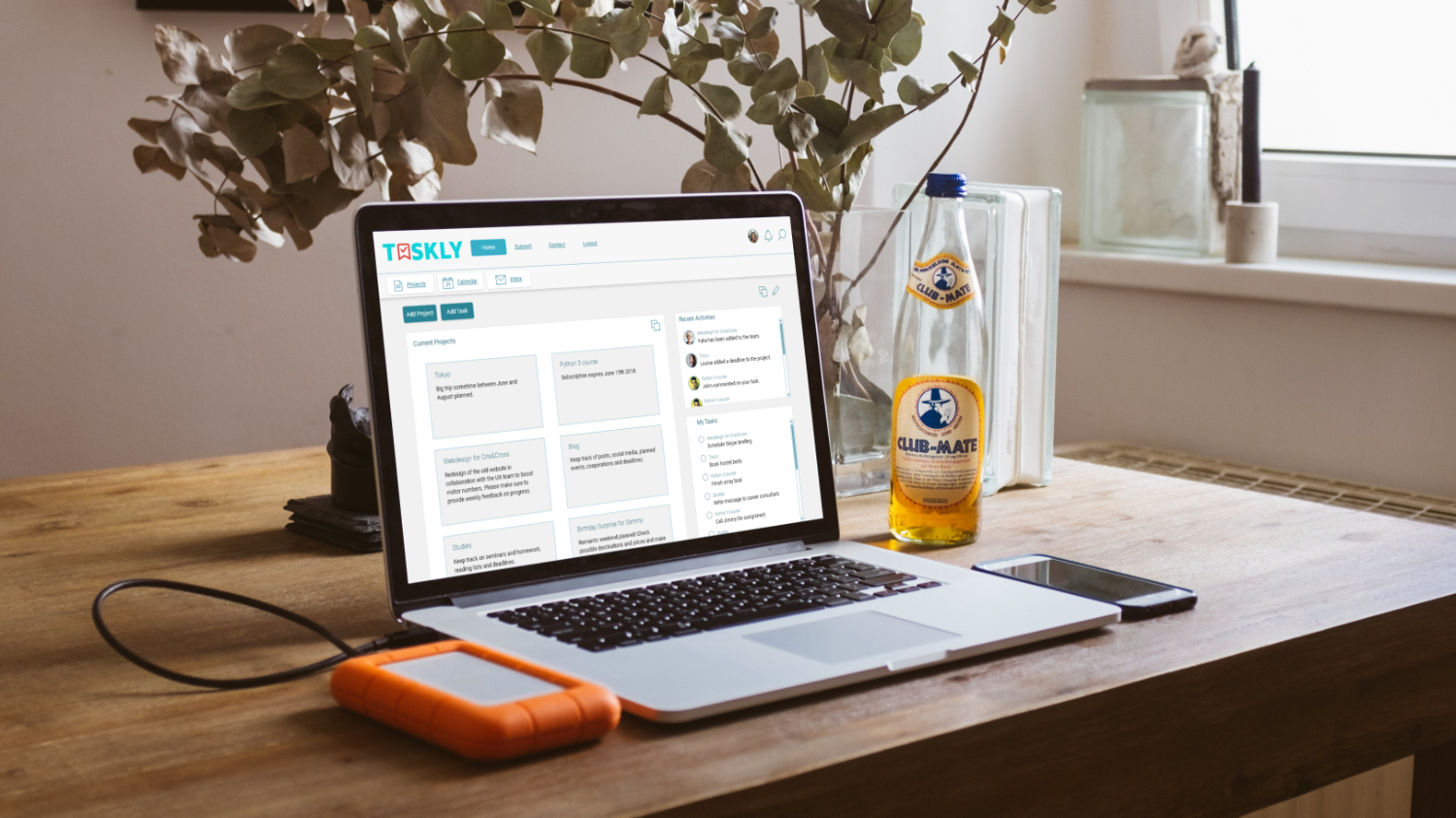
Taskly is a project management app concept that has been created during an intensive 3-month UX Design course at CareerFoundry. The challenge was to design a Minimal Viable Product (MVP) for fictional stakeholders including every step of the design process.
The following Tools were used: Adobe Xd, Adobe Illustrator, Affinity Photo, Balsamiq Mockups, InVision, Prott, Survey Monkey, Usability Hub.
I also posted this case study on my Béhance profile .
Design Process
The design process of Taskly is based on a user-centered approach. Each step of the process has been tested with members of the target group. Based on the tests' results, Taskly’s design has been refined with each step.
1. Research
Competitor Analysis
To gain an understanding of Taskly’s industry and potential customers, a competitor analysis was conducted in the beginning. For this, three competitors were chosen and carefully analyzed in points of marketing profile, SWOT profile, UI and UX design, content, design, and performance.
Based on those findings, it was possible to define Taskly’s first core features.
User Survey
In the next step, it was time to take a closer look at Taskly’s potential users. First, I conducted an online user survey using Survey Monkey to gain an insight on how task management apps are used, how users organize their projects and tasks, and which pain points may lead users to change the app or go back to using pen and paper.
The survey showed that task management apps are not as commonly used as one might have thought. But what is the problem with them?
The usability of task management apps seems to be an issue. Adding tasks or other content seems to take too much effort for users, so they rely on less flexible but easier to use solutions like pen and paper or analog calendars.
Also, people want a clear overview of their tasks. Cluttered dashboards or lists seem to be an issue.
The integration of other services does not seem to be as widely wished for as I expected.
User Interviews
The survey findings were then to be specified by qualitative data by conducting in-person user interviews. The purpose was to gain further insights regarding the core features that should be included in Taskly. The interviewee’s answers were taken to help to refine Taskly’s MVP features.
The following problems should be solved by Taskly:
- Organizing projects and keeping them up to date takes a lot of time.
- The app looks cluttered, the user has no clear overview.
- Missing feature to collaborate with others.
After conducting the interviews, it was clear that the market for project management apps is quite satisfied with solutions for professional users and big teams. Because of that, I decided that it would be best for Taskly’s strategy to emphasize private individuals, freelancers, and small businesses.
User Research
Personas
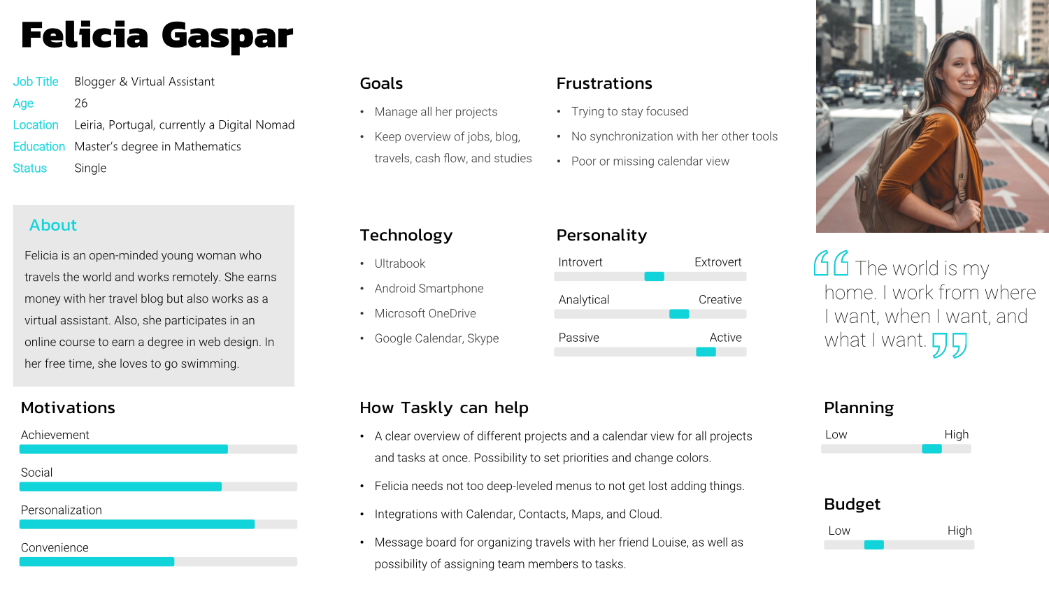
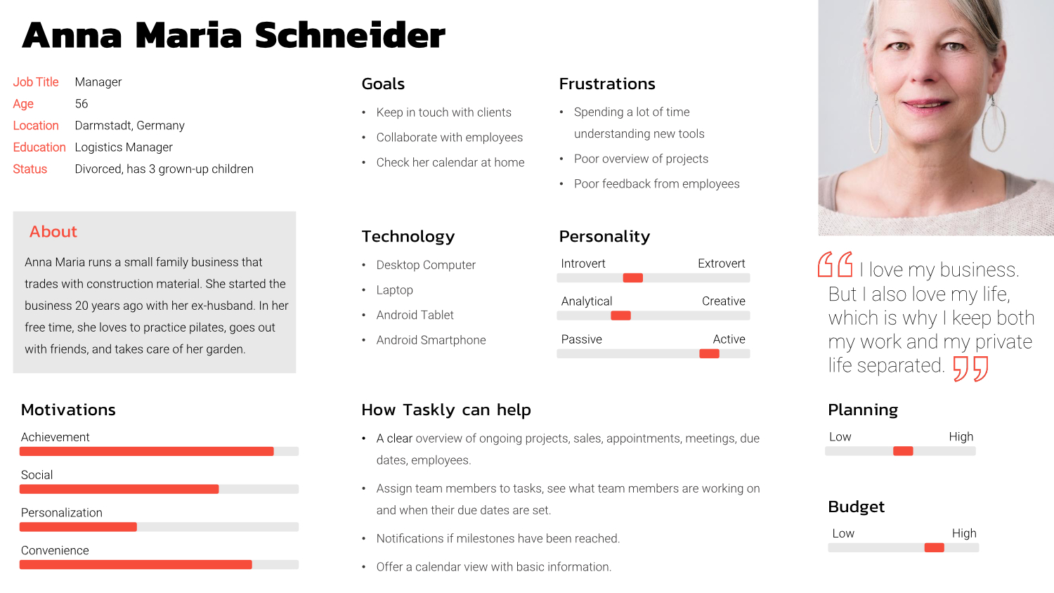
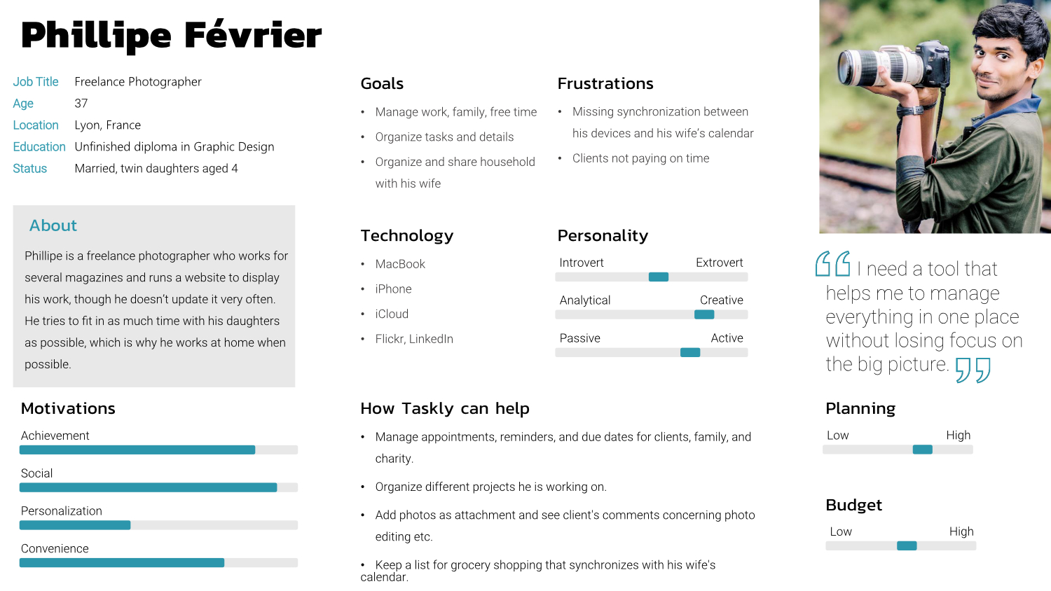
Based on the research conducted so far, I created three user personas that represent Taskly’s target group and ideal customers. Those personas were essential for the design process of Taskly.
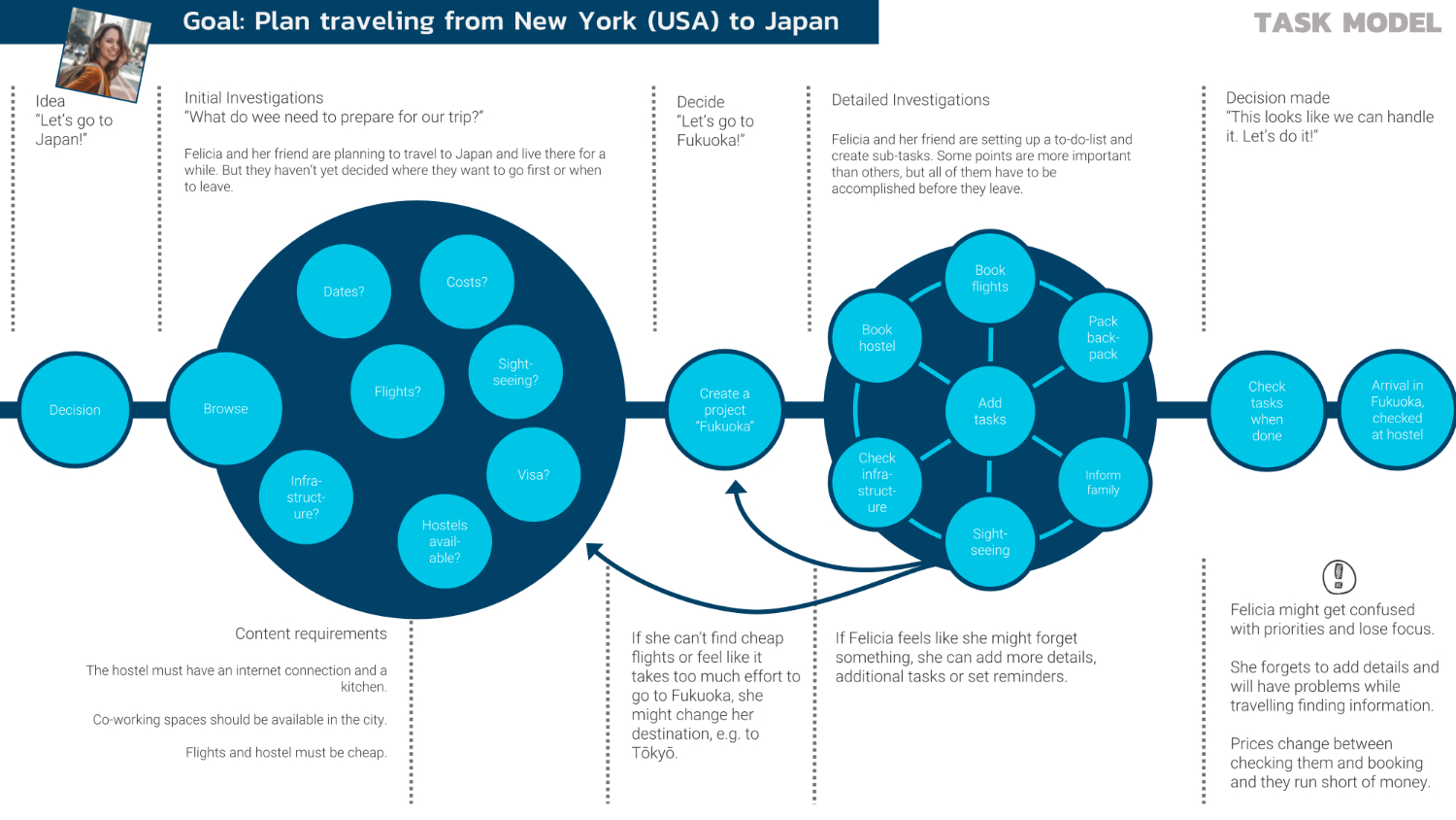
Task Model
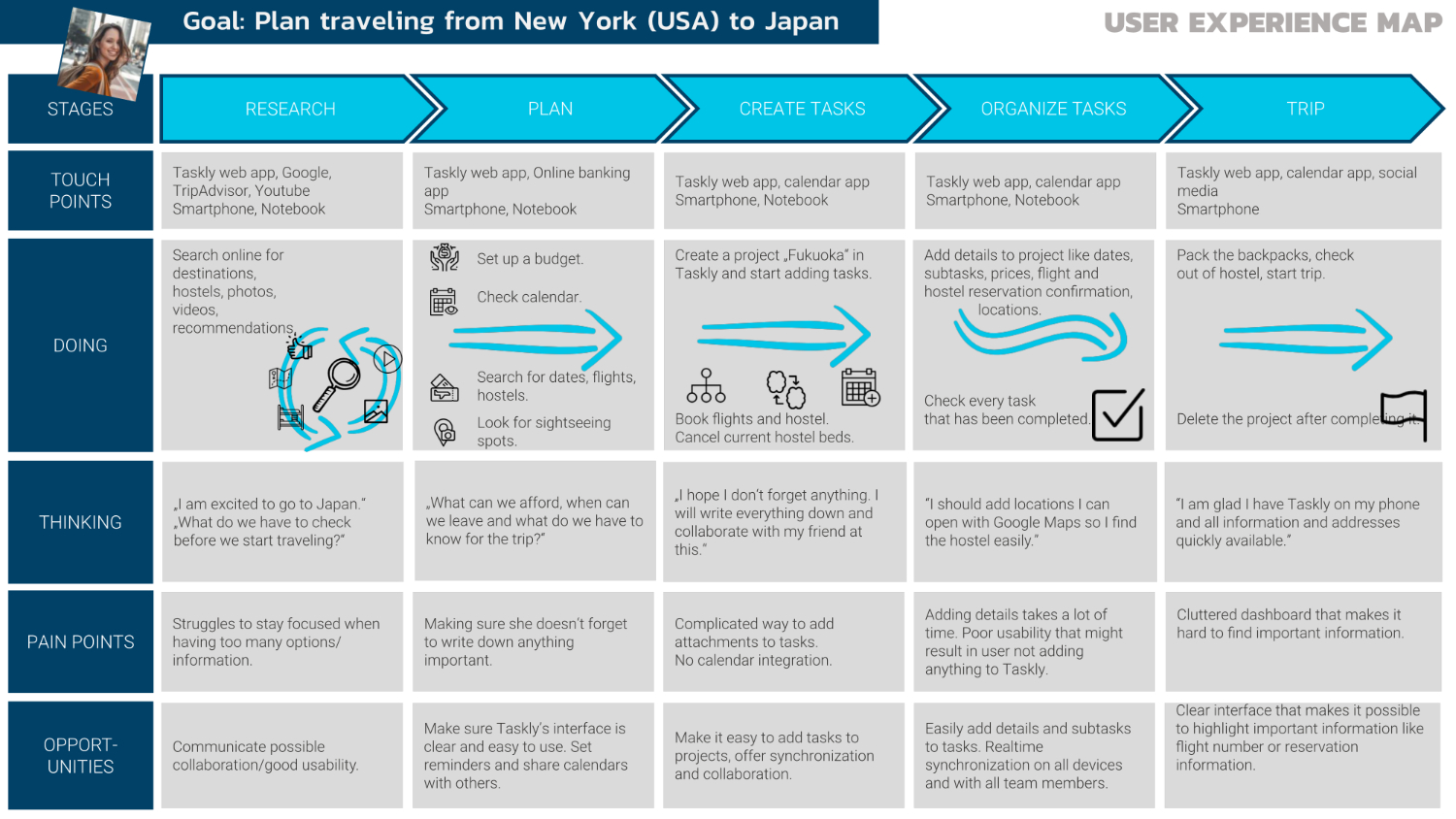
Task modeling is a powerful tool to gain insight into the needs and desires of users, which is why it can be an important step in the UX design process. For the task model, I chose the persona Felicia Gaspar and her goal to travel from New York, USA, to Japan.
User Experience Map
I created a customer experience map in order to visualize the journeys the persona Felicia Gaspar may experience when using Taskly for her goal to travel to Japan.
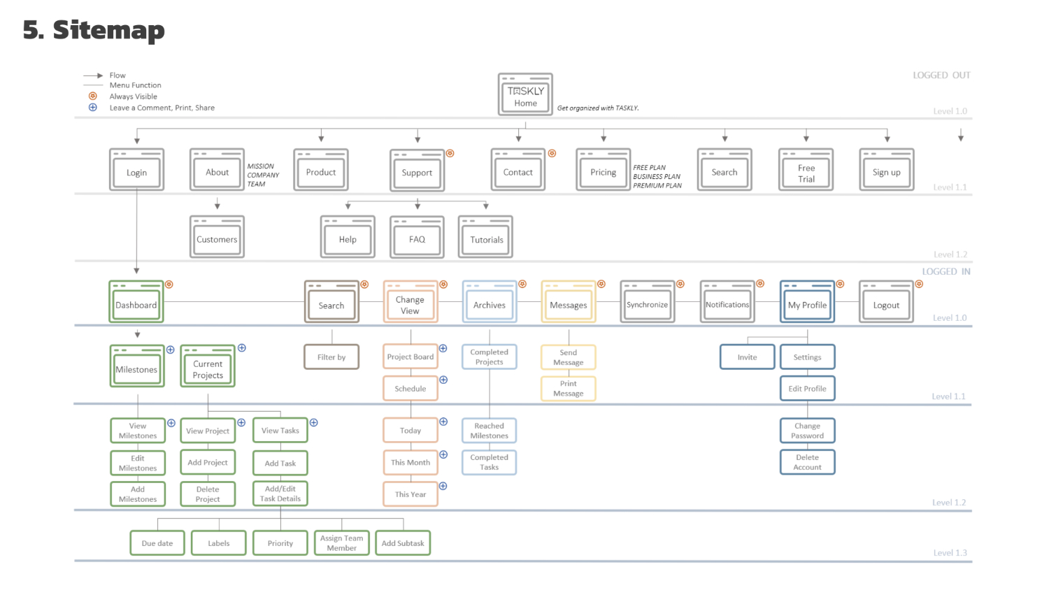
2. Information Architecture
In order to create a sitemap for Taskly, I conducted an in-person card sorting with five participants. They were given cards with terms from the core features that had been defined in the user research and other parts that would be necessary on Taskly’s website. The participants were asked to sort the cards into self-named categories. I took notes about questions, hesitations, and irritations as well as which terms were easily sorted.
After analyzing the results as well as the participant’s behaviors, I built Taskly’s sitemap.
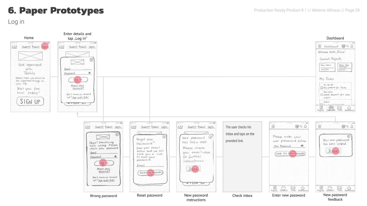
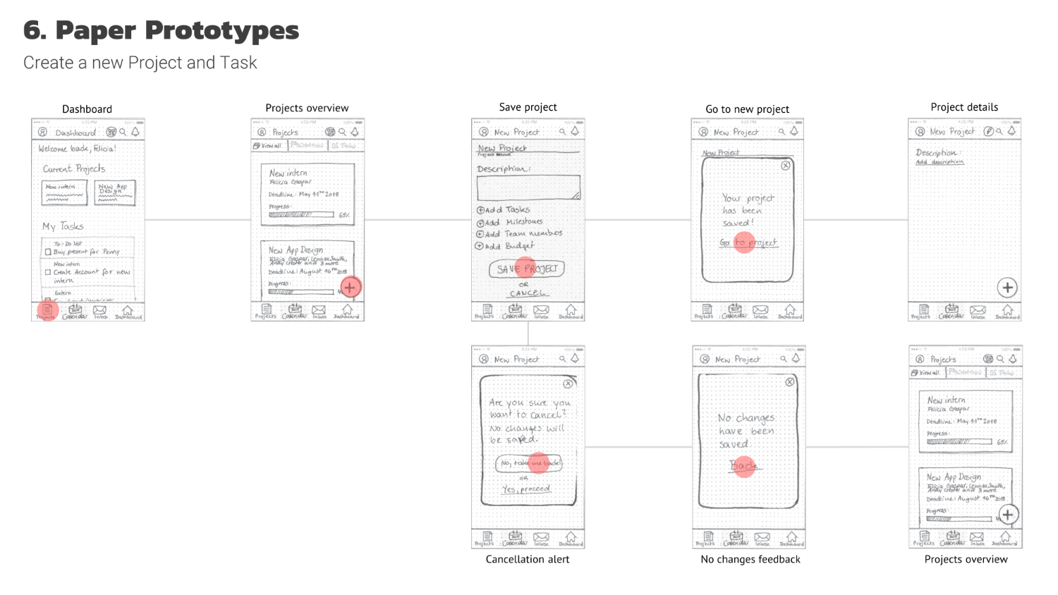
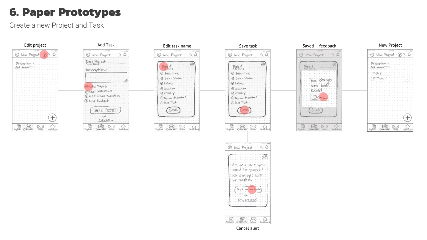
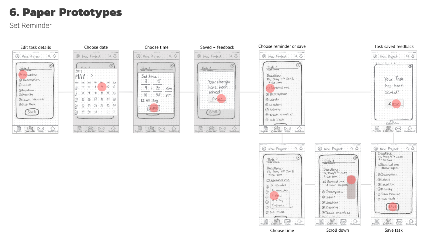
3. Paper Prototypes & Wireframes
The next step in Taskly’s production was to create a set of paper prototypes for the first three MVP features. After that, the prototypes were tested with the help of Prott, which made it easy for the testers to imagine using a real app.
User Testing
The testers were between 34 and 59 years old and all tech-savvy on different levels: a librarian, a switchboard operator, and an assistant.
The following goals were assigned for the testers:
- Log in to Taskly.
- Create a new project and add a task in the process.
- Add a deadline to your task and set a reminder.
- Look up your tasks for today and for May 8th, 2018.
- Look up all upcoming tasks for week 19 2018.
- Look up the task details for May 8th in the monthly overview.
The test showed how important it is to structure the questions carefully. The goals were set too big for the testers, which is why they had problems achieving them. For example, Tester # 2 would have saved the project first and then edited it to add the task. This was a problem as I did not prepare prototypes for this flow. For me, the learning was that user flows are very individual and should carefully be thought about when preparing user tests.
Also, the test revealed some pain points in the third core feature, the calendar view. The term “schedule” was confusing the testers because they were expecting the term “calendar.” Tester #1 did not recognize the icon in the bottom navigation bar. Another important finding was, that the calendar views should be connected so that the chosen day, week, and month always stay the same when switching views.
After analyzing the findings, the paper prototypes were revised before taking Taskly’s design to the next level.
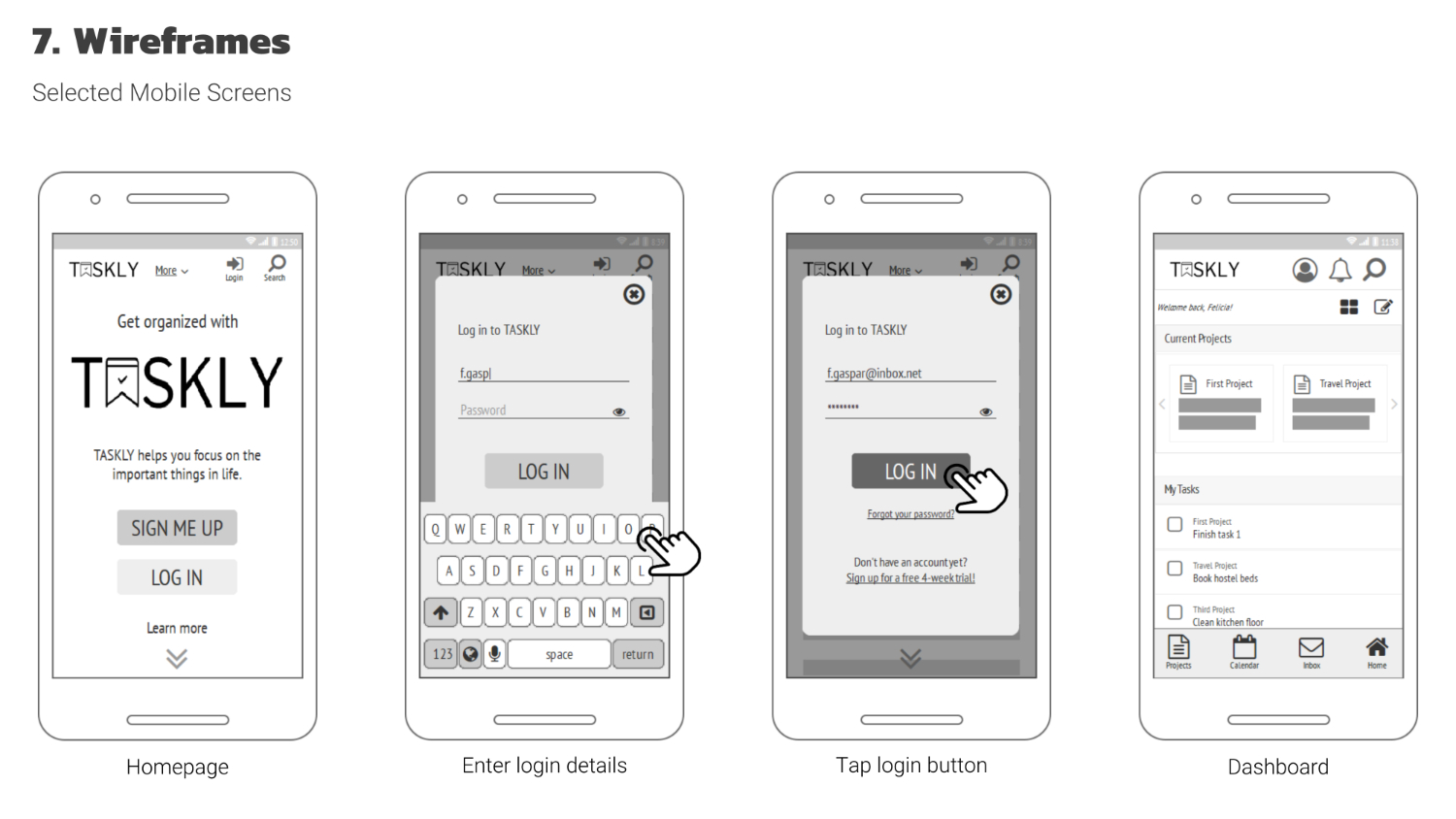
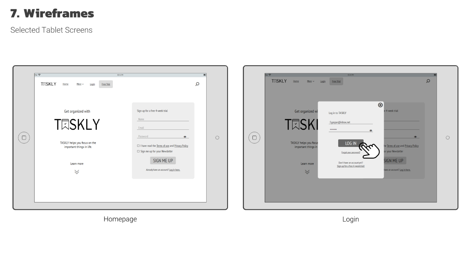
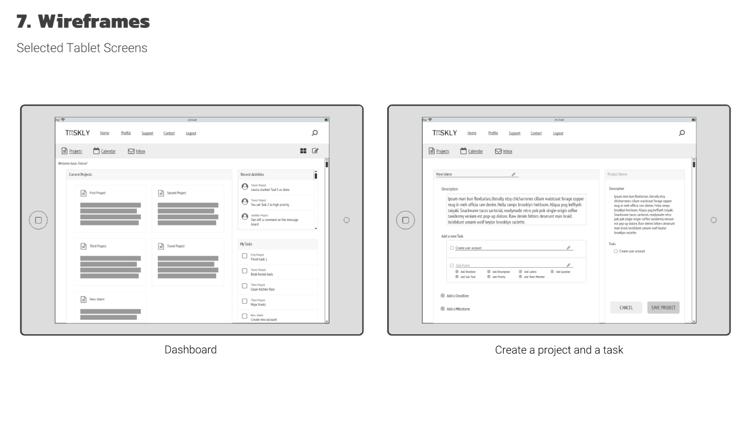
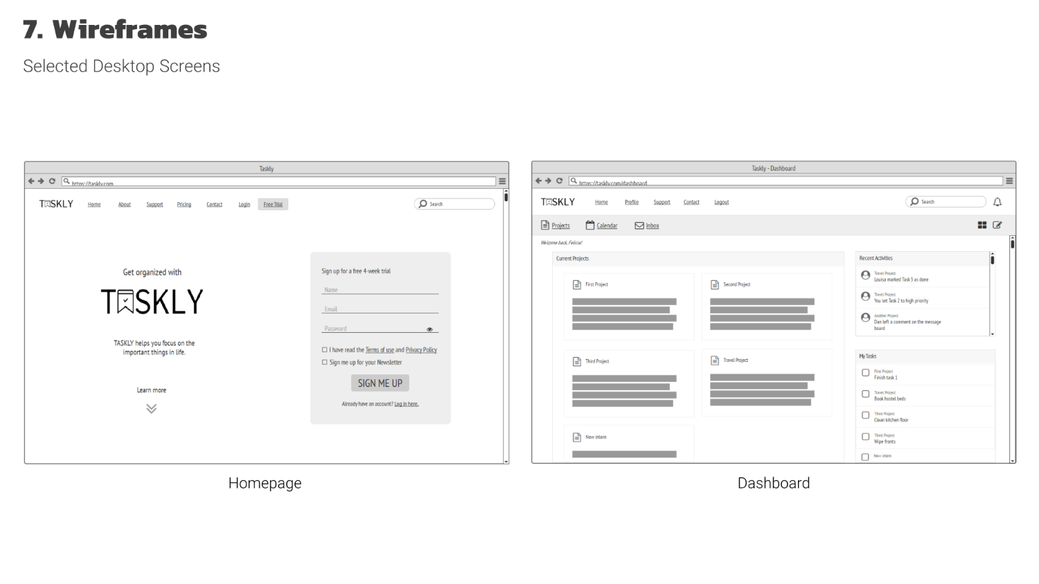
Wireframes
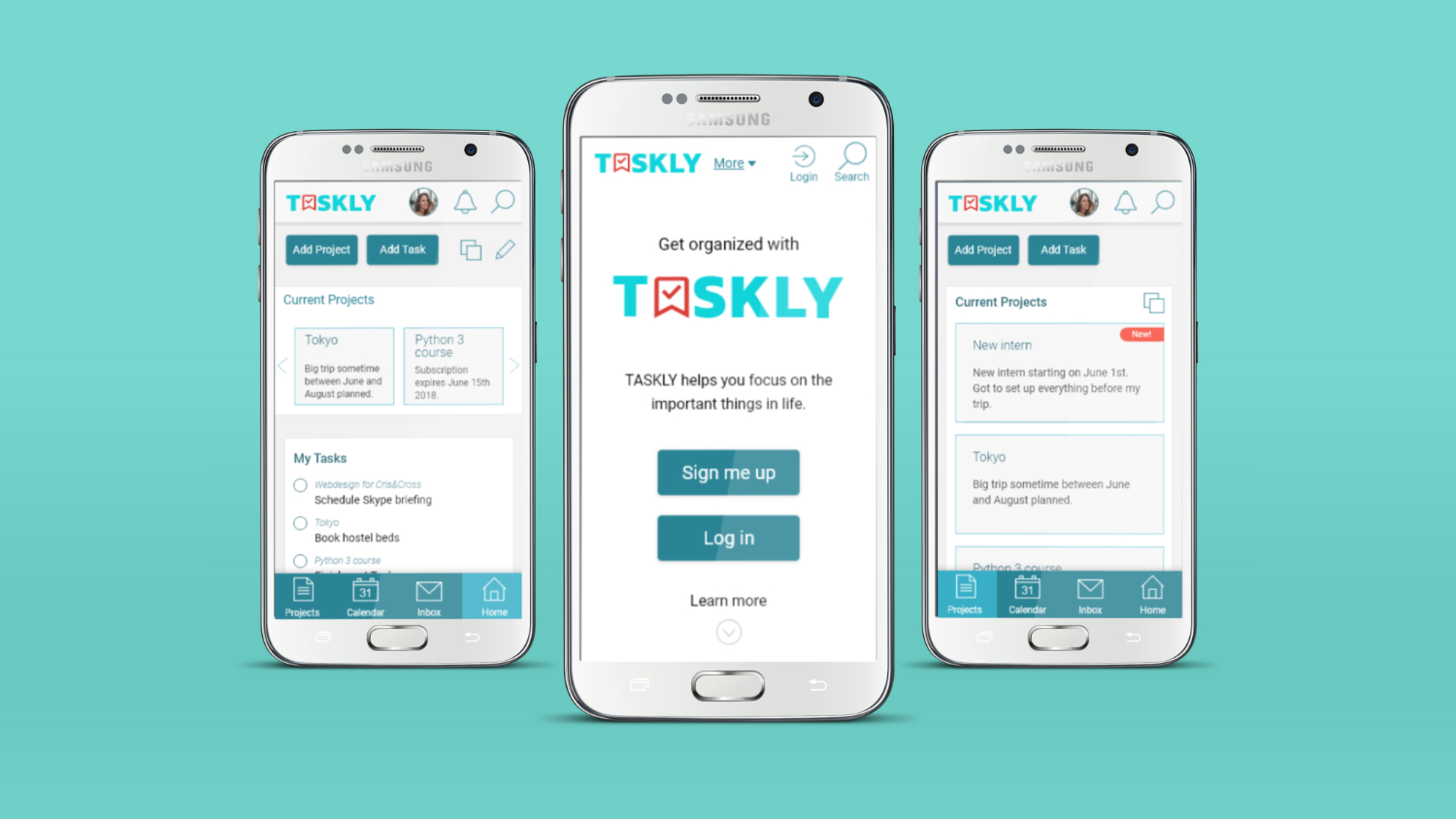
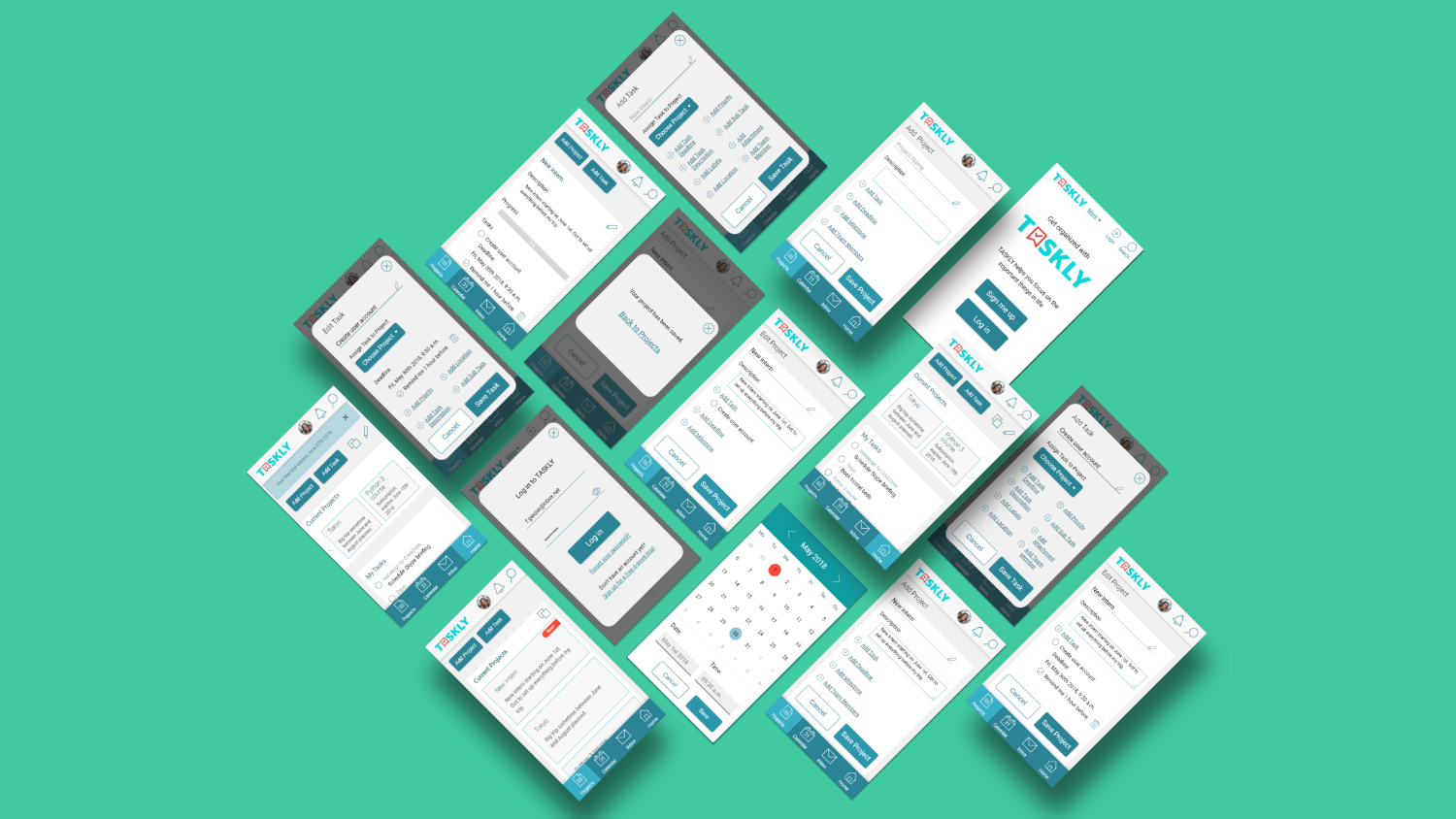
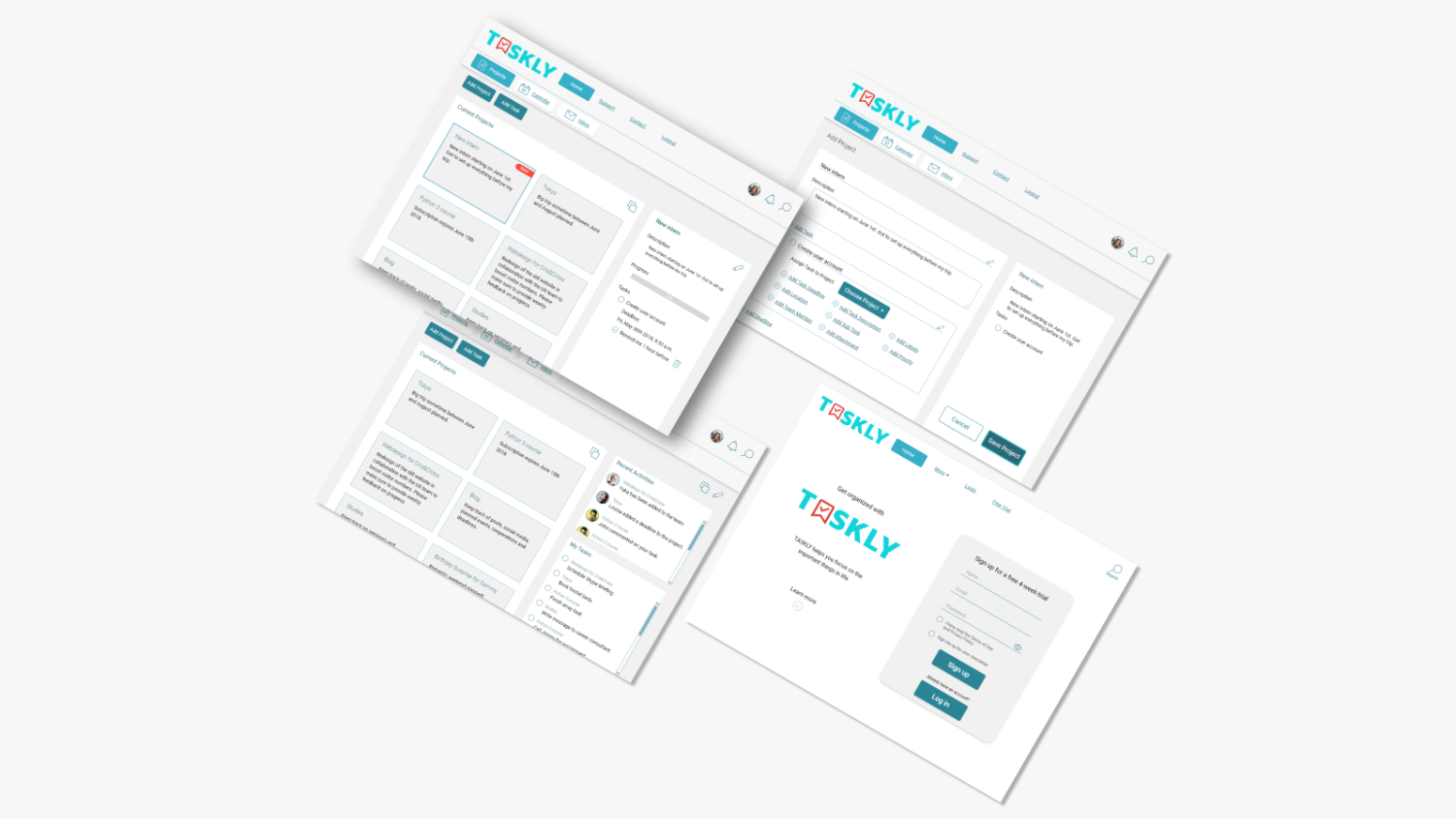
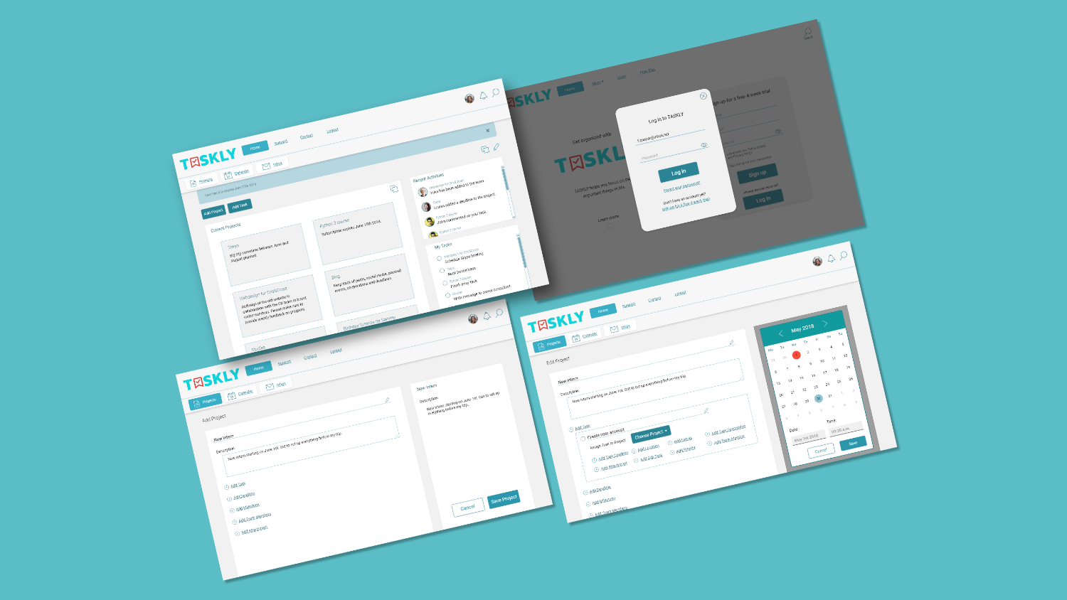
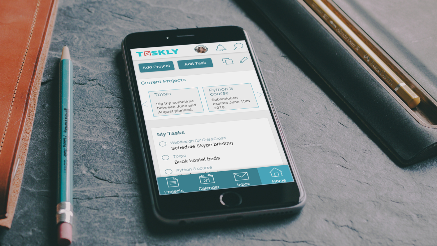
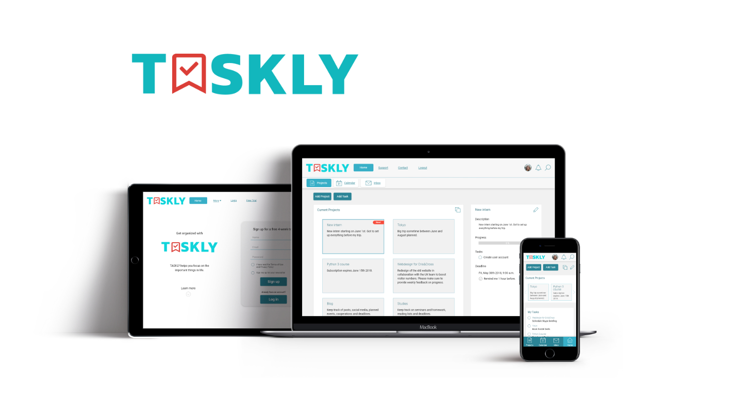
In order to take Taskly’s design a step further, I created digital wireframes with the help of Balsamiq. As a basis for those, I used the Bootstrap framework. To ensure Taskly would offer the best usability on any device, I made three different wireframes for a mobile, tablet, and desktop version.
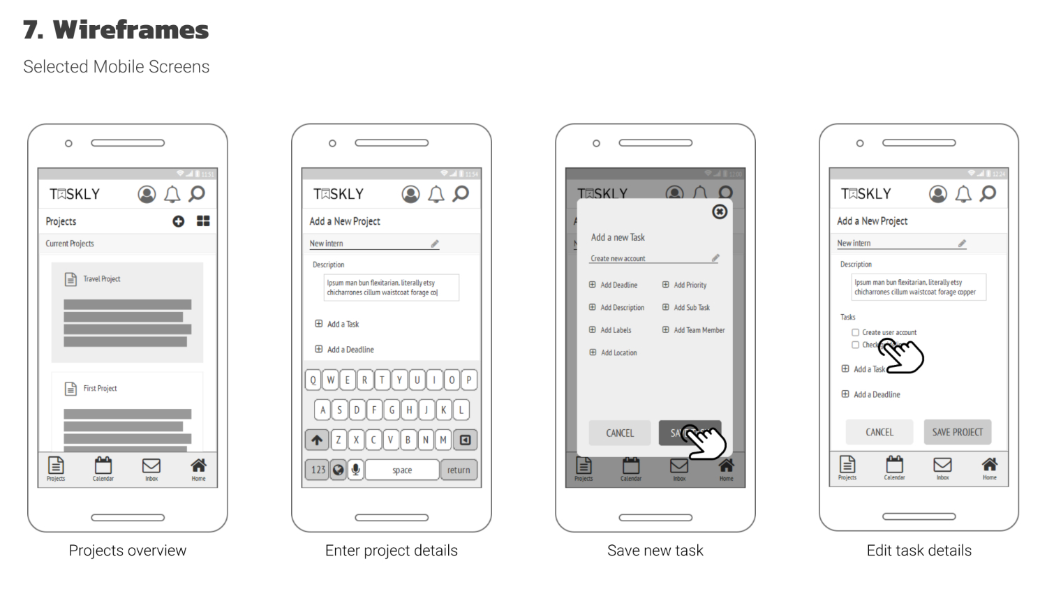
Usability Testing
The wireframes were then used for two usability testings: A non-interactive test with the printed wireframes and an interactive test with InVision app. According to the severeness and frequency of failures and comments, the following priorities have been set:
- High Priority:
- Add a button to add projects on the dashboard (all devices).
- Medium Priority:
- Set reminder by default (all devices).
- Highlight or resize the “Edit” button (mobile).
- Add an “Edit” button to tasks (tablet/desktop).
- Low Priority:
- Resize login button and sign-up form (tablet/desktop).
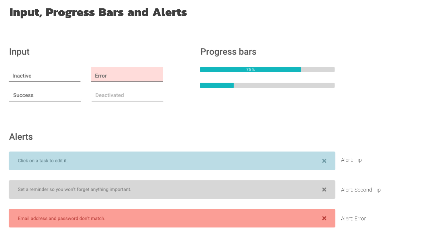
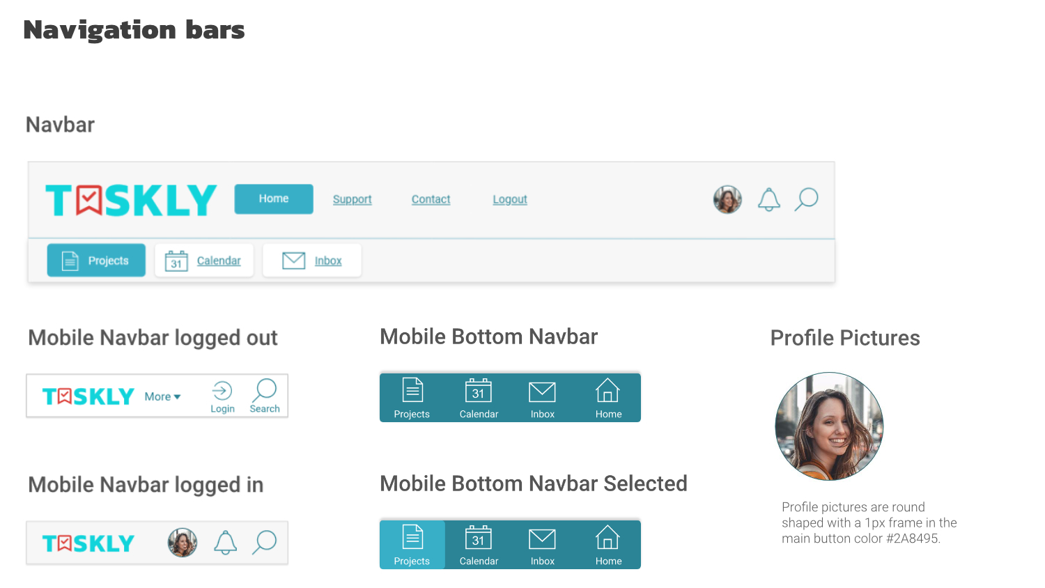
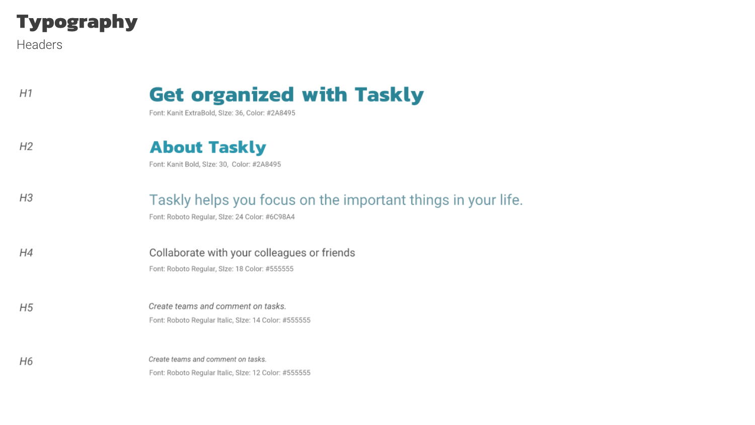
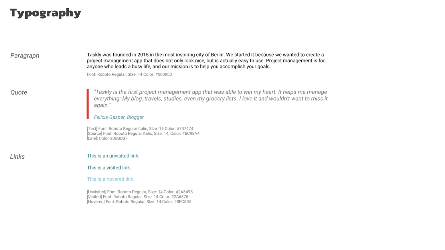
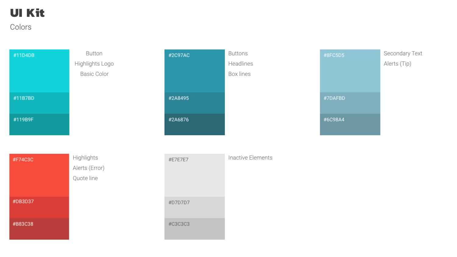
4. Visual Design
After designing and testing the wireframes it was time for some color. I picked different shades of blue and turquoise with a splash of bright red to make the color palette more interesting. My inspiration board is available on Pinterest. Overall, I tried to incorporate the findings from the research and testings and provide a clean and minimalistic, yet interesting look for Taskly.

5. Tests and Revision
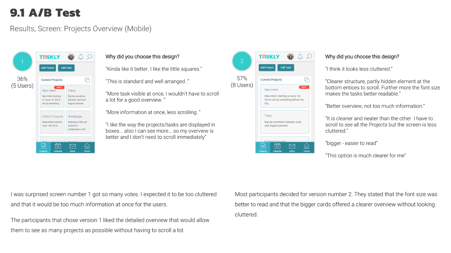
The results of the Usability tests were taken as a basis to create a UI kit and high fidelity prototypes. To test the usability of the project overview screen, an A/B test was conducted via Usability Hub. The result was taken to refine Taskly’s design even more.
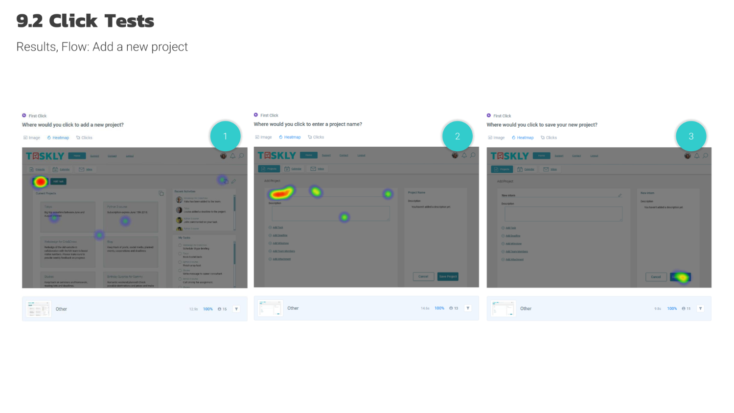
Also, three click tests were conducted for the user flow of adding a new project. These tests showed that the design was already working, but a few improvements could be made. Those findings helped to refine Taskly’s final design.
Conclusion & Credits
Throughout the design process, I stayed close to my original objective to provide users with an easy and uncluttered look that provides good usability. I gathered some feedback after the completion of the concept and received a lot of positive responses. Since UX Design is all about the users, this showed.
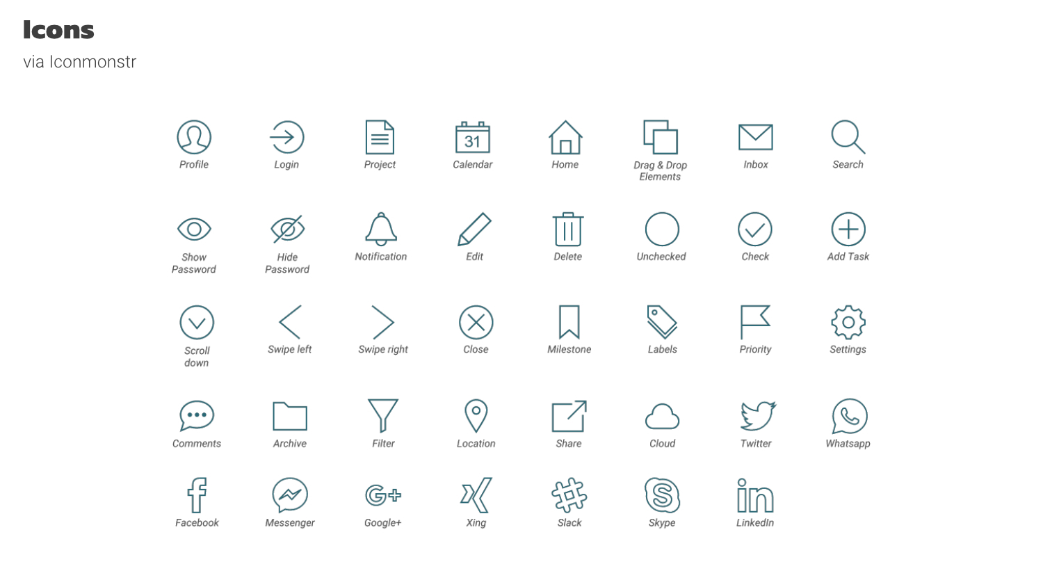
I worked on this project by myself with the help of my tutor and mentor at CareerFoundry. Also, I got some valuable insights from early adopters that represented the target group for Taskly. The icons I used were taken from flaticon.com and iconmonstr.com . The header mockup is by Radek Grzybowski .